An Easy Guide To The CSS Box-shadow Property.

Hi, I'm Alaa Aldybous 🌸
An Electrical and computer engineering student and a Self-Taught Web developer
I write about:
- what I learn
- CSS Art
- tips & tricks-hacks that I discover throughout my journey
- Electrical engineering what I learn as a student
Skills:
- MATLAB
- C++
- Python
- HTML & CSS
I'm learning
- Python-Django- Flask
- Arduino
I'm making this article for beginners that are new to box-shadow. To me, it took me some time to get the hang of it.
So let's start with box-shadow syntax. ✍
box-shadow: X-Axis Y-Axis Blur Spreed (here the color of the shadow)
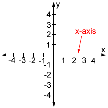
X-Axis
When you add a value to the X-Axis you move the shadow along the X-axis Example:
- giving it a positive value will move the shadow to the Right
- giving it a negative value will move the shadow to the Left
☝️ For visualization if you are a visual learning like me 😁
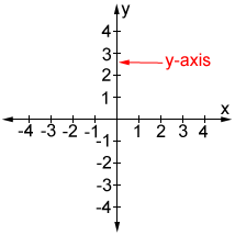
Y-Axis
When you add a value to the Y-Axis you move the shadow along the Y-axis Example:
- giving it a positive value will move the shadow to the Up
- giving it a negative value will move the shadow to the Down
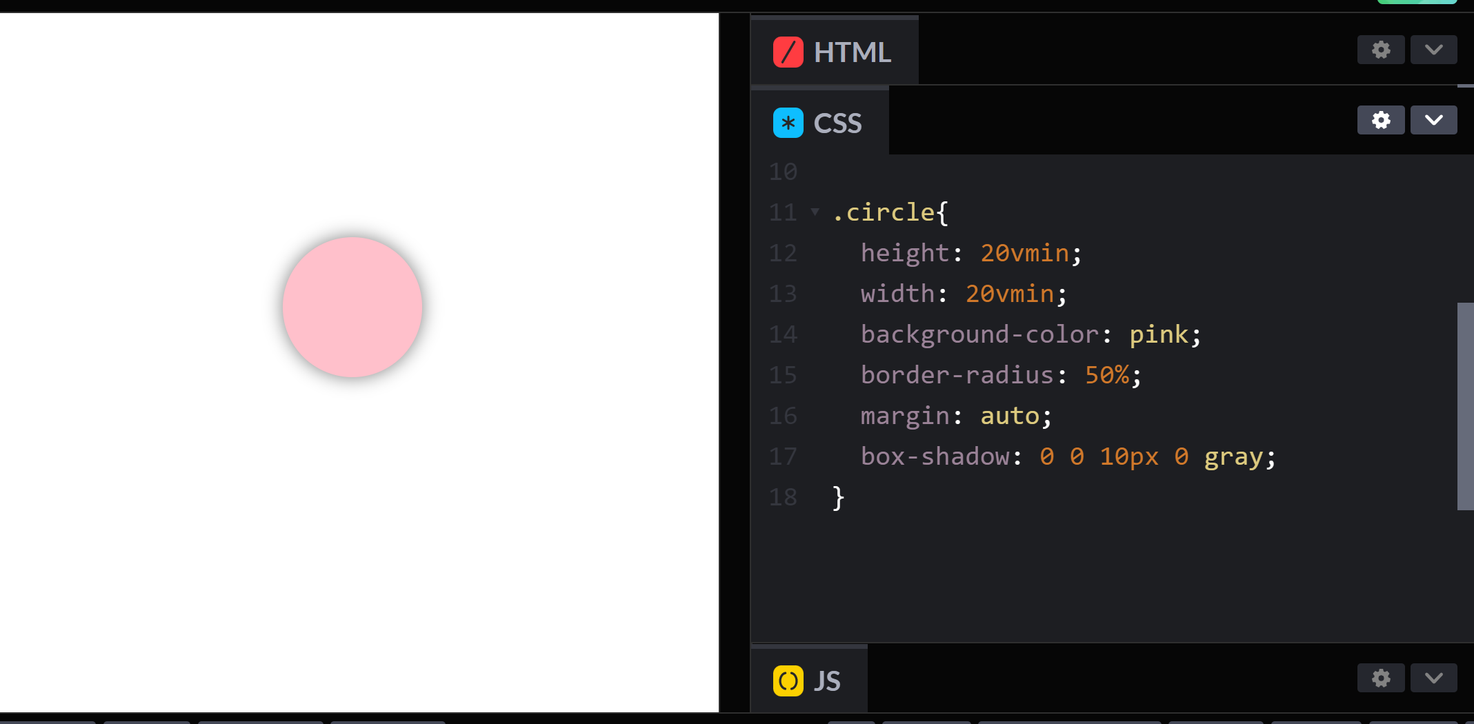
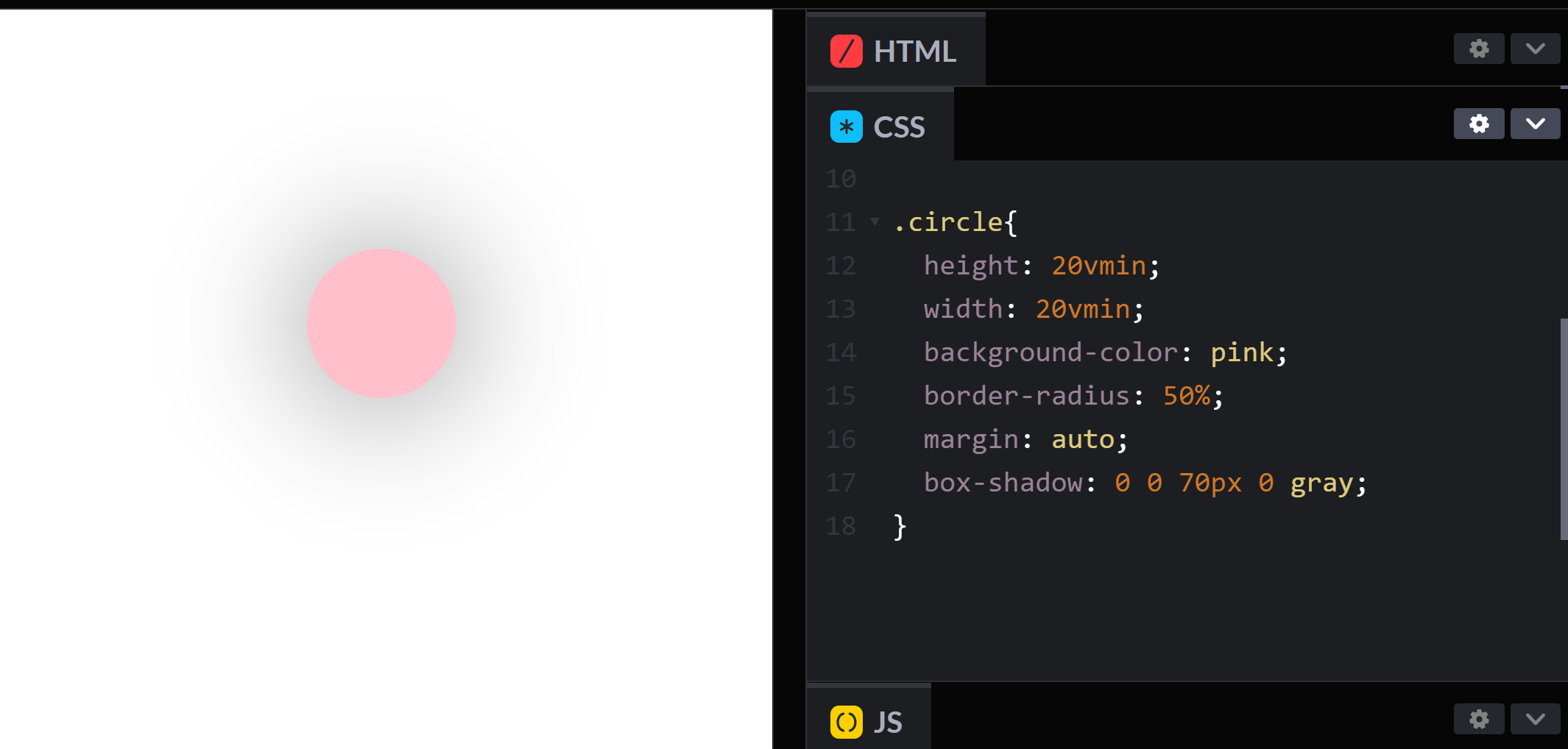
Blur
Blur gives the shadow that soft edge.
The higher the value you give the softer the edges get and the box-shadow color will blend even more with the background which leads to spreading the color and lowering the opacity.
here are some examples:
A Smaller value:
box-shadow: 0 0 10px 0 gray;
A Higher value:
box-shadow: 0 0 70px 0 gray;
Spread
Spread increase the size of the shadow.
Example:
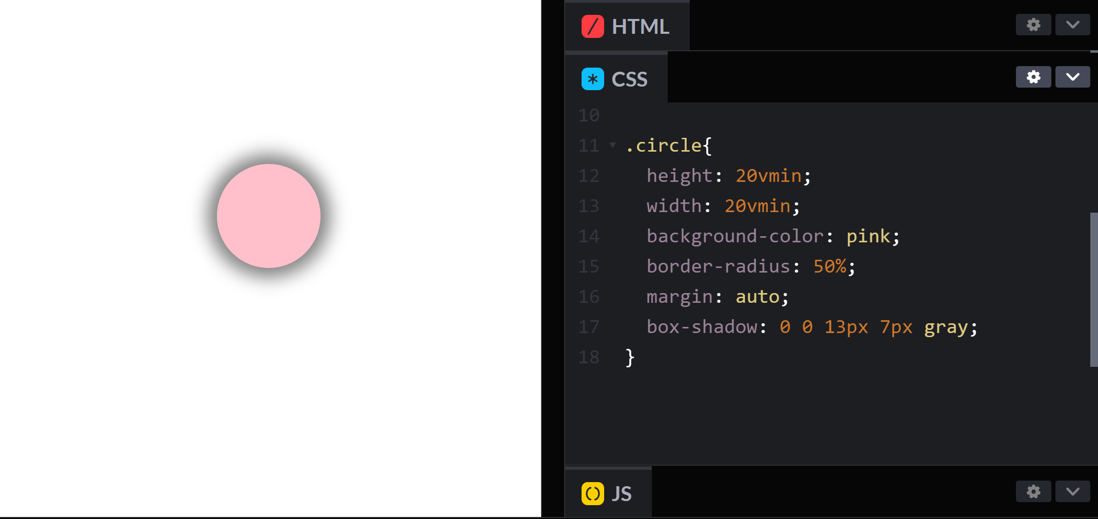
box-shadow: 0 0 0 7px gray;
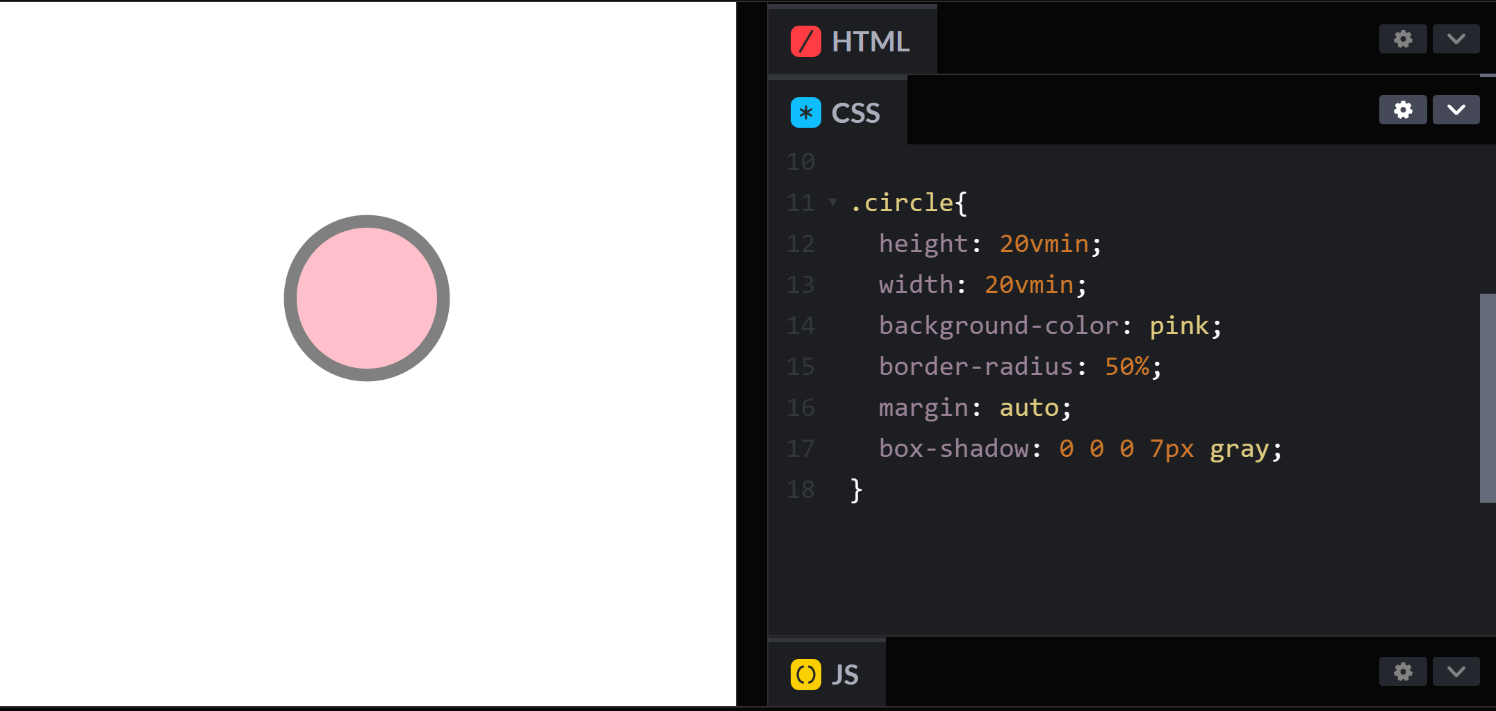
The shadow is the gray border around the pink circle
The value I gave it was 7px, if I gave it a higher number I will get a wider border.
The edges of the border would be harsh if we didn't give the blur any value.
box-shadow: 0 0 13px 7px gray;
Tips 🪄
you can use box-shadow to duplicate an element 🤯
instead of making two divs and styling both of them, you could just make a box-shadow where the blur and spread values are zero then you could move the shadow using the x-axis and y-axis.
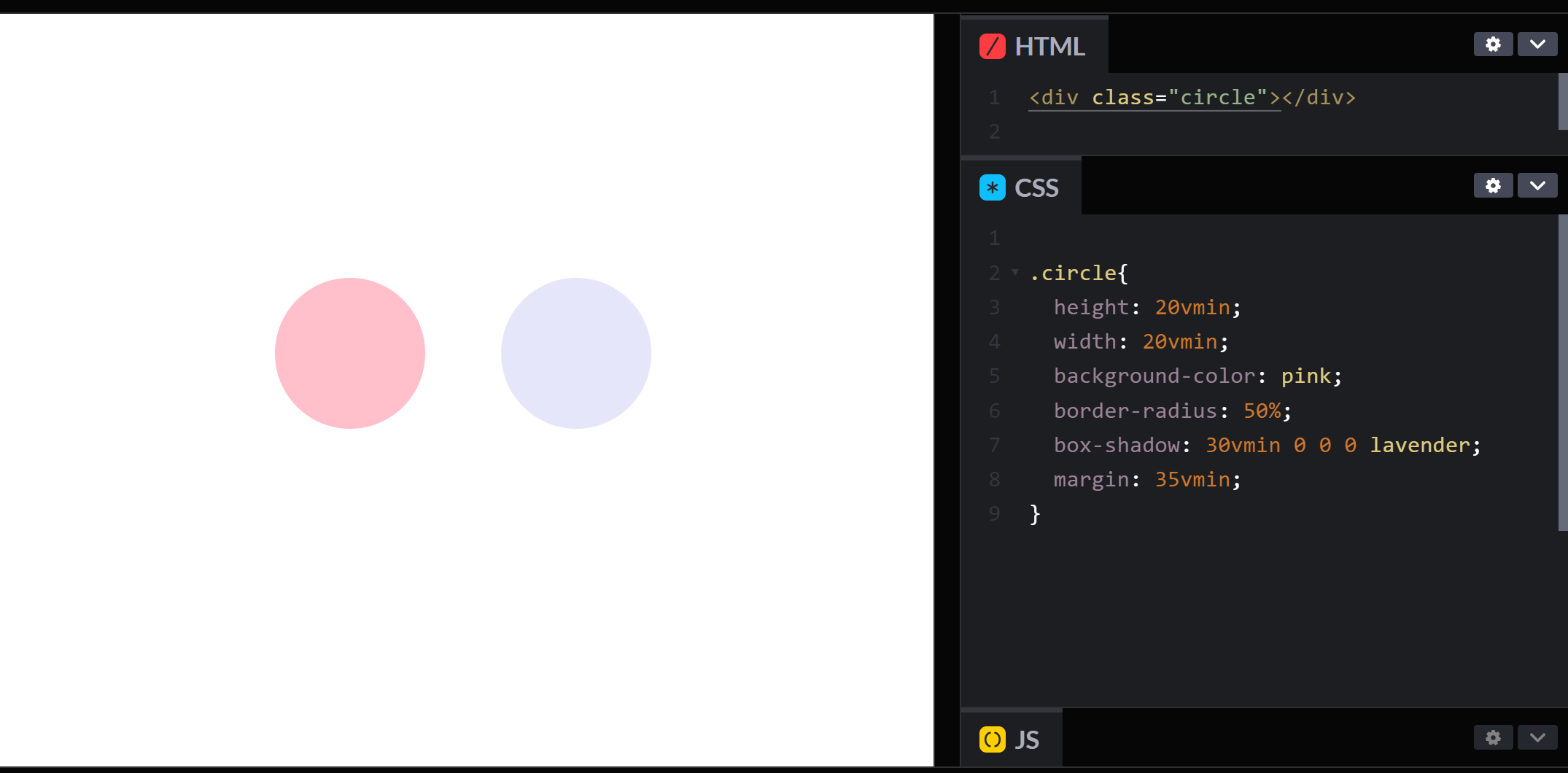
The lavender circle is the shadow I gave it the color lavender is to show you which one is the shadow though I could have made them the same color if I want a certain effect.
And that's it Hope this article was helpful. 🥰
If it was helpful I hope you would consider buying me coffee 😊 https://www.buymeacoffee.com/Alaaanan ☕


