How to Make a Responsive NavBar with CSS-Only
A Guide on how to create a responsive navbar without using Javascript

Hi, I'm Alaa Aldybous 🌸
An Electrical and computer engineering student and a Self-Taught Web developer
I write about:
- what I learn
- CSS Art
- tips & tricks-hacks that I discover throughout my journey
- Electrical engineering what I learn as a student
Skills:
- MATLAB
- C++
- Python
- HTML & CSS
I'm learning
- Python-Django- Flask
- Arduino
When I first attempted to create my portfolio I wanted to find a way to create a responsive navbar with CSS only, cause I still didn’t learn JavaScript yet 🙁, and trying to follow a Javascript tutorial blindly without understanding what’s going on isn’t effective at all. So after some research, I found a method to create a responsive navbar with CSS only and I’m going to share it with you today.😊
1- Design the Navbar
Design all the versions of the navbar according to the screen size, and decide the breakpoint of each version of the navbar. “Decide the max and min-width of each version”
this was my Desktop version of the navbar 🖥
 this was my “mobile” small-screen version of the navbar📱
 also, don't forget to design the menu of the mobile version
2- Open your HTML file
1- create a nav tag and give it a class
<nav class="main-nav"></nav>
2- make an unordered list, give it a class name
Then add all the items you want in the navbar inside that unordered list
<nav class="main-nav">
    <ul class="navlinks">

    <li><a href="#about-me">About Me</a></li>
    <li><a href="#skills">Skills</a></li>
    <li><a href="#projects">Projects</a></li>
    <li><a href="#blog">Blog</a></li>
    <li><a href="#contact-me">Contact Me</a></li>

</ul>
</nav>
3- Add the logo "optional"
<nav class="main-nav">

    <a href="index.html" class="logo">Alaa Anan</a>

    <ul class="navlinks">

    <li><a href="#about-me">About Me</a></li>
    <li><a href="#skills">Skills</a></li>
    <li><a href="#projects">Projects</a></li>
    <li><a href="#blog">Blog</a></li>
    <li><a href="#contact-me">Contact Me</a></li>

</ul>
</nav>
4- Add an input tag with the type checkbox and add an icon inside the label tag.
This icon will act as the icon you use to display the navbar in the mobile version.

the icon that's inside the label is the one on the right ☝️ "visual reference" anyway😁
Also, give the input an id and the Label a class name.
<nav class="main-nav">

    <input id="check" type="checkbox">
    <label for="check" class="menu-btn">
        <i class="fas fa-bars">
    </label>

    <a href="index.html" class="logo">Alaa Anan</a>

    <ul class="navlinks">

    <li><a href="#about-me">About Me</a></li>
    <li><a href="#skills">Skills</a></li>
    <li><a href="#projects">Projects</a></li>
    <li><a href="#blog">Blog</a></li>
    <li><a href="#contact-me">Contact Me</a></li>

</ul>
</nav>
here I used a font awesome icon as the menu button
You can use any type of icon
3- Open your CSS file
1- Start with giving the navbar a main styling
which mean a style that would stay the same in all the versions of the navbar
main-nav{
height: 20%;
position: fixed;
background-color: #E5EBFF;
}
2- Style the Desktop version🖥
Note that it is up to you whether you want to style the mobile version first or the desktop version first

we used inline-block because it is commonly used in the navbar to create a list of items horizontally
.navlinks li{
display: inline-block;
margin: 0 20px;
}
style the navbar normally as you usually do
.logo{
font-family: Chilanka;
font-size: 24px;
line-height: 26px;
line-height: 100%;
align: Left;
vertical-align: Top;
text-decoration: none;
margin: 20px;
}

.navlinks{ /* the class name of the ul 'unordered list' */
line-height: 26px;
float: right;
list-style: none;
margin: 0;
padding: 0;
}

/*bunch of styling to the li & a tag also I added a hover effect*/

.navlinks li{
display: inline-block;
margin: 0 20px;
}

.navlinks li a{
text-decoration: none;
font-size: 24px;
transition: all 0.3s linear 0s;
}

.navlinks li a:hover{
background-color: rgba(128, 144, 255, 0.5);
color: black;
}
- we gave the input element display: none;
we also styled the label but remember that the label tag has an icon in it so basically, we are styling the icon
Also remember that in the desktop version we don’t want that icon so we gave the display property the value none
#check{ /* check is the id of the input element */
display: none;
}

.menu-btn{ /* .menu-btn is the label class name */
font-size: 20px;
line-height: 26px;
color: black;
cursor: pointer;
float: right:
margin-right: 40px;
/* here the display is none*/
display: none;
}
3- Style the mobile version 📱
Note that when you style the mobile version you need to keep in mind that we need to style both the navbar and the menu that appears after clicking the menu button

Without clicking the menu button ☝️ "visual reference" again 😁

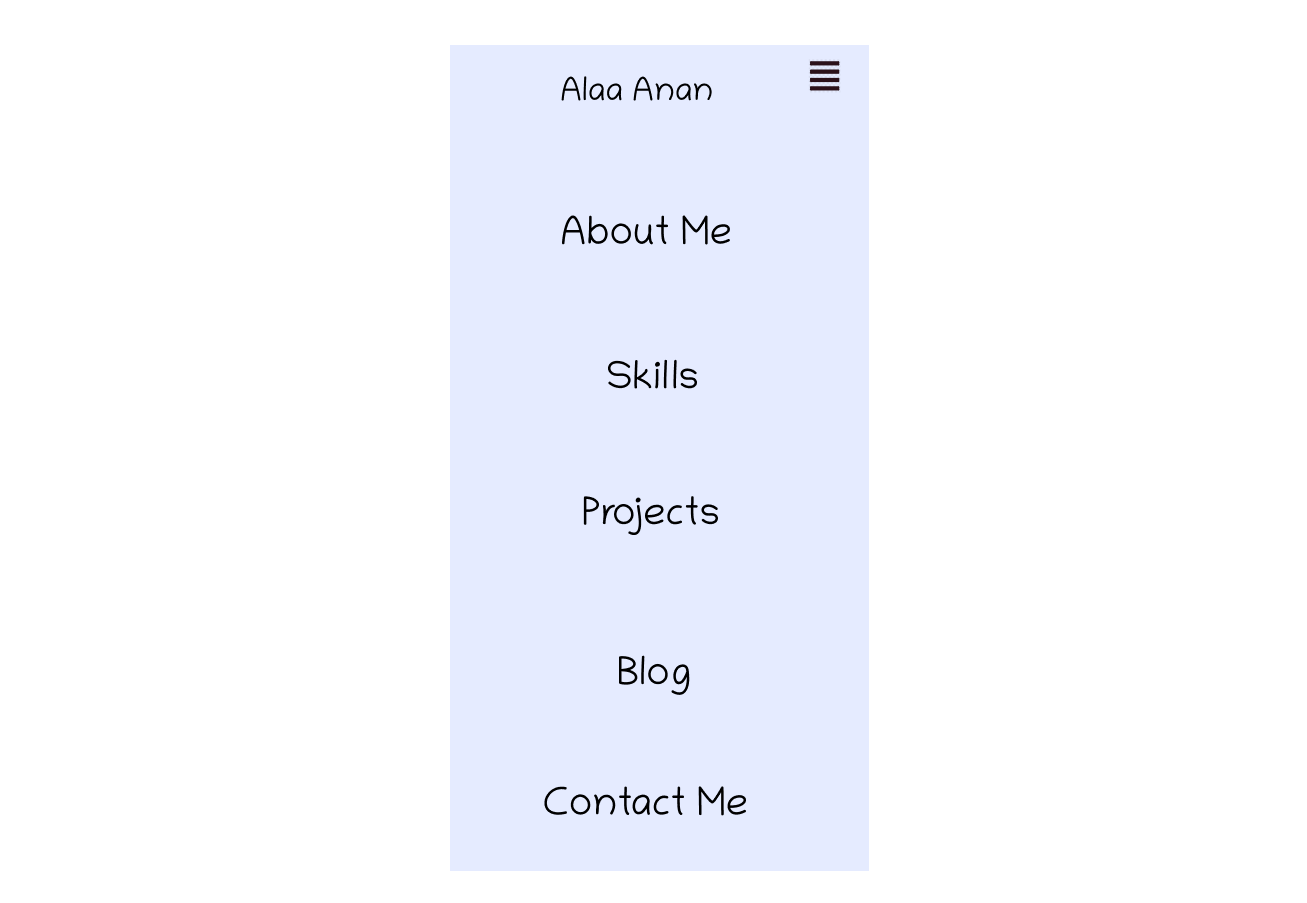
After clicking the menu button ☝️ "visual reference" again 😁
Style the menu list
note that you could also start with the navbar
navlinks{ /* the ul class name*/
postion: fixed;
text-align: center;
line-height: 40px;
transition: all 0.5s;
width: 100%;
height: 200vh;
background-color: #E5EBFF;
visibility: collapse;
}

navlinks li{
display: block;
}

navlinks li a{
font-size: 36px;
}
in the navlinks (the menu) we gave it visibility: collapse; which hides the navlinks
Style the navbar
.logo{
margin-left:
font-size: 25px;
}

.menu-btn{ /* the label's class name which is an icon */
/*changed the display to block*/
display: block;
margin:right;
font-size: 25px;
}

.menu-btn:focus {
color: white;
}
here we changed the display value of the label from none to block to make it appear again
4- then add this line of code to the mobile version this is the line of code that makes the navbar responsive
#check:checked ~.navlinks {
visibility: visible;
}
here we are implying that when we click on the menu-btn the navbar will appear and when we click on it again it will disappear
Reminder
check → is the input element id
navlinks → is the unordered list class name that contains the navbar elements
so #check:checked ~.navlinks means that when the input’s checkbox is checked the styling will get applied and the navlinks will appear (remember we gave the navlinks above visibility: collapse; which hides it)
Let me explain in more detail :checked is a pseudo-class selector it is used with radio - checkbox - option, in other words, it is used with elements that can get checked or turn on and off
:checked can either overwrite the old styling or add new styling to the element
The :checked pseudo-class can be used in 2 ways to add or change the styling of an element:
1- by adding :checked to the input id name -> give it some styling. Here the styling will appear on the input element when it gets checked
(in other words this method is used to style the input element itself)
Example
#check:checked{
background-color: lavender;
}
here the input element will get a lavender background when it get checked
2- by add :checked to the input id name -> adding ~ sign -> add the element that would get styling when the input gets checked -> add the styling
(in other words, this method is used to style a different element when the input element is checked)
Example
#check:checked ~ .navlinks {
visibility: visible;
}
here the styling will apply to the unordered list which is the navlinks
Also you can do this to more than one element For example, I used it here to style more than one element when I check the checkbox
.navlinks{
    text-align: center;
    line-height: 40px;
    transition: all 0.5s;
    width: 100%;
    height: 100vh;
    background-color: #E5EBFF;
    position: fixed;
    visibility: collapse;
    padding: 0;
    top: 5rem;
    display: flex;
    flex-direction: column;
}

#check:checked ~ .navlinks{
    visibility: visible;
}

#check:checked ~ .logo{
    display: flex;
    align-items: center;
    justify-content: center;
    margin: 0;
    padding: 0;
    margin-left: 50px;

}
So here what happened is that when I check the checkbox
the navbar will be visible and the logo placement will change from left to center
also, I added display flex to straighten stuff up for different devices inside the menu
And that's it Hope this article was helpful. 🥰
If it was helpful I hope you would consider buying me coffee 😊 buymeacoffee.com/Alaaanan ☕
REFERENCE 🔺️
when I was googling I scrumbled upon this YouTube videos https://www.youtube.com/watch?v=oLgtucwjVII&t=241s that thought me this method thanks to the video creator 😊💕


